When is a window not a window?

Arti was in NYC for a week in September.

It was Friday afternoon free admission time when hundreds lined up several city blocks to get into MoMA, Museum of Modern Art. Once in there, it was like inside the Tower of Babel (not that Arti had been there), but just imagine the whole world had converged in this space, all kinds of languages were heard.

After visiting MoMA, some questions came to mind. Here are the Q & A’s. (Photos were allowed. The following were all taken using the iPhone 6)

When is a window not a window?

When it’s encased in plexiglass, with the name Marcel Duchamp placed beside it, declaring it to be an objet d’art. Dada-di, Dada-dum…

Not a window.jpg

Or, when is a spider an objet d’admiration, something larger than life?

When it evokes a Kafkaesque vision:

Giant Spider 1

Spider

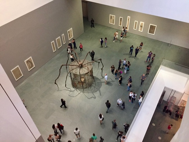
And why is the arachnid a double-edged sword?

Well, the artist Louise Bourgeois (1911-2010) saw it as a friend when it captured bothersome mosquitoes in her Connecticut country home. As well, Bourgeois also saw it as a symbol of her mother. Wait, not in looks or nature, but in the work that they do. Her mother was a tapestry restorer. Bourgeois saw sewing and spinning web to be a similar form of action.

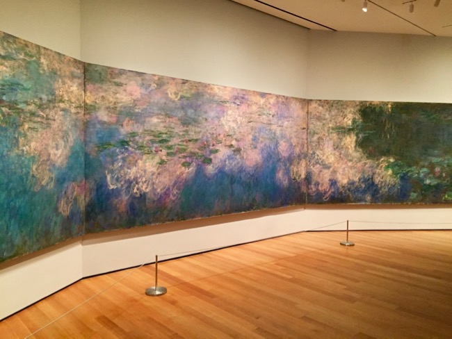
How do you take a good photo when there are crowds everywhere? A bit similar as how to get to Carnegie Hall, patience, patience, patience. The following are the before and after effects at Monet’s Lily Ponds:

Crowds.jpg

Monet's Water Lilies 1.jpg

What’s the major excitement of the whole experience? The ecstasy of seeing some famous artworks unexpectedly, ones that Arti had never thought she’d see in real life.

Christina’s World (1948) by Andrew Wyeth (1917-2009). And what is the blue patch in the middle? Arti’s watermark.

Christina's World.jpg

The only Edward Hopper (1882-1967) at MoMA, Gas (1940). As an avid bird watcher, Arti of course would have loved to see Nighthawks but Gas would do, for the serendipity.

Gas

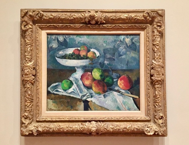
And glad to see Paul Cézanne’s (1839-1906) healthy diet:

Healthy diet

Ta-da! This is probably one of the most compelling reasons for many to visit MoMA, van Gogh’s The Starry Night (1889):

Starry Night

Which was the most memorable for Arti?

Jackson Pollack.jpg

One: Number 31, 1950 (1950) by Jackson Pollock (1912-1956)

Never thought it was so big, 8′ 10″ x 17′ 5 5/8″ (269.5 x 530.8 cm). No easy dripping.

***

A few related posts on Ripple Effects:

Arles: In the Steps of van Gogh 

Inspired by Vermeer

Edward Hopper, William Safire, the Visual and the Word

Alex Colville and the Movies

Art and Cliché

Gifts to Myself

December 26 is Boxing Day in Canada.  Like Black Friday in the US, that’s the time to pick up bargains, and pay half the price you did just two days before.  And like Black Friday, it’s the time for legitimate self indulgence for the common good, our economy.

In recent years I’ve avoided shopping on Boxing Day. I know some people getting up at 5 am to line up for a store opening at 6.  My own experience of the Boxing Day craze had been standing 3 or 4 people deep, stretched out my arm to the sale table and grabbed whatever I could out of it, hopefully something I needed.

Out of curiosity, I gave it a try again this time around… and sure glad I ventured out.  I didn’t have to fight the crowds, and waited just a bit longer in line-ups . But well worth it.  Here are some of the gifts I got for myself at half price: wall calendars which I won’t be hanging up.

I know, prices here are not as low as in the US… we’re always paying a few dollars more in printed products. But just about $10 each, these beautiful art calendars are good buys for me. Best of all, I found all my favorite artists.  Those familiar with Ripple Effects would know.  I’ve posted on Vermeer (Dutch, 1632-75) here, Edward Hopper (US, 1882-1967) here, and images of René Magritte (Belgian, 1898-1967) here and here.  So I was really excited to be able to find big prints of their works.

VERMEER 2011


The 12 paintings are some of Vermeer’s well known works.  The cover of course is the most famous, The Girl With The Pearl Earring (1665).  If you’re interested, you might like to read my reviews of the book based on this painting and the film adaptation here.

I have seen two of the paintings in the calendar, The Lacemaker (1669) and The Geographer (1668-69), both at The Louvre.  Interesting that the calendar prints are about the same size as the originals, or maybe even a tad bigger, for The Lacemaker.  Here are my photos of them hanging on the wall in the Louvre:


But the July print stands out, the only one that has an exterior view.  It’s my favorite of all the twelve months.  The Little Street (1658):


Edward Hopper 16-Month 2011 Calendar


I have 16 prints of some of my favorite Hopper paintings.  A few of them I’ve posted before, asking readers’ opinion on them. Here are a couple more that I’d like to elicit your views:

People In The Sun (1960)


Chop Suey (1929)


Magritte 2011


The cover is the Belgian artist’s work in 1953, Golconda.  Just wondering… is this the origin of the term “rain man”?  Or, are the men going up like balloons?

René Magritte was born just 16 years after Hopper, and died the same year, 1967.  So contemporaries they had been for some years, but a world of difference in terms of style.  I like the realism and existential elements hidden in Hopper’s works, but I also enjoy Magritte’s surrealist and whimsical images, openly challenging our sense of reality:

The Treachery of Images (1929)

Ceci n’est pas une pipe:  This is not a pipe.  Your take on this?


The Interpretation of Dreams (1935)


In the past years, I’ve saved up a lot of visuals just like these calendars, as teaching materials for adult ESL.  But this one definitely cannot be used for vocabulary building.  Just hang on… that may well be what Magritte is saying: ‘In a dream world, a horse can be a door, a jug a bird…’  And for that matter, how do you know you’re not dreaming right now?  Mmm… just wondering, has the movie Inception included Magritte in the credits?


***


Edward Hopper, William Safire: The Visual and the Word

If you could say it in words, there would be no reason to paint.

In general it can be said that a nation’s art is greatest when it most reflects the character of its people.

—- Edward Hopper (1882 – 1967)

Edward Hopper’s words point to the power of the visual.  I always find Hopper’s realist paintings hauntingly retrospective, convey indescribable feelings, a sense of loneliness, a touch of alienation, yet, it’s hard to say exactly what it is.

Some use the phrase ‘urban loneliness’ to pinpoint the sentiment, as most readily expressed in his famous painting Nighthawks.  But others find the term too parochial even, opting for the more universal description of the human condition, ‘existential loneliness’.

In this visually-driven age, where pictures are instantly produced by a click, eliminating the wait for film processing, and where digitally created images can elicit unimaginable possibilities, has the value of words diminished, both in function and significance? In a time when ‘reading skills’ refer not only to the comprehension of the written language but the deciphering of graphics and visual symbols, has the power of words been eroded?

Does the recent passing of William Safire, called ‘the oracle of language’ by the NY Times, represent the passing of an era?  How many are left to champion the traditional form of communication, to point out word origin, to extol proper grammar usage?  While these gatekeepers are frowning on the split infinitive, the rest of the world has already jumped on board the newer vessel to boldly go where no person has gone before. The reign of literal communication has gradually (or quickly, or___ you fill in the blank) been replaced by the more accessible instant imaging, flickring, youtubing…

Let’s hope too that the traditional art form of painting will not be soon replaced by iPhone sketching.  If the New Yorker’s cover artist is using an iPhone app to touch-produce its cover pages, will the demise of oils and paints be far away?

Of course, I come to praise Hopper, not to bury words, or paints. Rather than saying his paintings defy literal descriptions, let’s just take up this bemusing challenge and do a role reversal:  What words conjure up in your mind when you look at these Hopper paintings? Let’s celebrate words, and paints, while we still have them.

Of all the subjects in his works, I particularly like the solitary figure, or the non-figure, like the room devoid of human presence.  Here are some of them:

Automat (1927):  Layered with subtext, what are the stories behind this lone female customer at the automat in such hour?  What is a good description of her predicament?

Automat 1927

.

New York Movie (1939): Here’s the reason why I love Hopper’s works.  The contrast, the darker side, the quiet undercurrent beneath the glamorous, the sombre reminder of complexity.

eh_new_york_movie

.

Rooms by the Sea (1951):  A touch of Magritte I feel.  An example of what I call the non-figure.  The philosophical quest of knowing: If nobody’s around to see it, does it still exist?

Edward - Hopper - rooms_by_the_sea

.

Cape Cod Morning (1950):  Unlike his other works, this solitary female figure is positive, eager,  enthused, and achingly expectant.  Is she a symbol of the optimism of a new age, or will she be disillusioned as reality sets in? 1950 or 2009, is there so much difference anyway?

Cape Cod Morning Hopper (1950)

.

Gas (1940):  I’m sure it’s not all about gas… does it allude to the lone traveling salesman like Willy Loman, or the gas station owner like George Wilson in The Great Gatsby?

gas_by_edward_hopper

.

Nighthawks (1942):  Perhaps the most famous of Hopper’s paintings.  As some call it, the depiction of ‘existential loneliness’.  Is that Sartre sitting there all alone at 2:00 am, contemplating in a diner with no exit?

nighthawk-by-edward-hopper

****

Click here to go to a related post ‘Inspired by Vermeer’ with another Edward Hopper painting, Morning Sun.


Inspired by Vermeer

I’m just having so much fun discovering the immense influence of Vermeer on his posterior that I must post some more.  Here are a few interesting samples that I’ve found.

Holland has long been renowned for its natural light, and Vermeer has long been credited with his keen sensitivity in capturing that.  Here’s his View of Delft (ca. 1660),  which Marcel Proust called “the most beautiful painting in the world”:

Vermeer View of Delft

Visiting the Netherlands in 1886, Claude Monet adopted Vermeer’s point of view in observing the light of Holland in his painting of tulip fields and a farmhouse near Leiden:

Monet Tulip Fields near Leiden, Netherlands

**

Look at this famous Vermeer painting entitled Woman in Blue (ca. 1663):

Vermeer Woman in Blue

Van Gogh commented in 1888 on the exquisite artistry of Vermeer’s colors in the painting, “…blue, lemon-yellow, pearl-gray, black and white… the whole gamut of colors.”   He must have really liked Vermeer’s palette:

Van Gogh Self Portrait at Easel

**

Vermeer loved his subjects by the window.  Here’s another well known painting Girl Reading A Letter At An Open Window (1658), and below, Salvador Dali’s parody, homage, to Vermeer’s signature pose entitled Disappearing Image (1938).  Like Hitchcock, Dali liked to put himself in the picture:

Vermeer Girl Reading A Letter By The Window

Dali The Image Disappears

Tom Hunter Woman Reading A Possession Order

Now here’s a more contemporary example.  UK artist Tom Hunter, the first photographer to have a one-man show at the National Gallery of London, won the Kobal Photographic Portrait Award in 1998 with this poignant picture of a squatter, entitled Woman Reading a Possession Letter:

How about this from American realist painter Edward Hopper, Morning Sun (1952):

Edward Hopper Morning Sun

(For more Edward Hopper, Click Here.)

**

Director Peter Weir has created some ‘Vermeer scenes’ in his highly acclaimed 1985 movie ‘Witness’, with Harrison Ford and Kelly McGillis.  I can’t find pictures of the scene where the young Amish woman Rachel Lapp (McGillis) tending the wounded detective John Book (Ford) in the attic of her Amish house.  That is signature Vermeer.  But this one by the window can give you a glimpse.  Look at the contrast between the light and shadow on the two characters, the innocent and cloistered Rachel Lapp and the street-smart and gun wielding John Book:

Witness Harrison Ford and Kelly McGillis

**

And last but not least, Vermeer’s inspiration on modern packaging and product design.  Click here to read more about it.

Vermeer inspired Dutch Chocolate Cream Liquer

****

Related Posts:

Vermeer in Vancouver: Noticing the Obvious

Girl With A Pearl Earring

Edward Hopper, William Safire: The Visual and the Word.

Arles: In the Steps of Van Gogh

The Letters of Van Gogh

***

Sources and links:  All Vermeer paintings, Click here to go to Essential VermeerClick here to Tom Hunter Website. Click here to Webmuseum for Edward Hopper. Click here to Van Gogh Gallery. Click here to Metmuseum for Monet’s Tulip Fields near Leiden.