Abbey Road & Notting Hill

FRIDAY OCT. 7

For the last day in London, we wanted to grab the chance to go see places we hadn’t been to before. Our plan for the day: first to Abbey Road, then Notting Hill.

This is probably the most famous zebra crossing in the world. And that of course is the location where The Beatles’ Abbey Road album cover was taken. Tourists would gather right at the crossing, stopping cars frequently.:

Zebra Crossing.jpg

… and actually pose crossing it, making numerous takes, cause it’s just hard to find no cars coming, then snapping the right pics at the right time in the right pose:

Pose Crossing.jpg

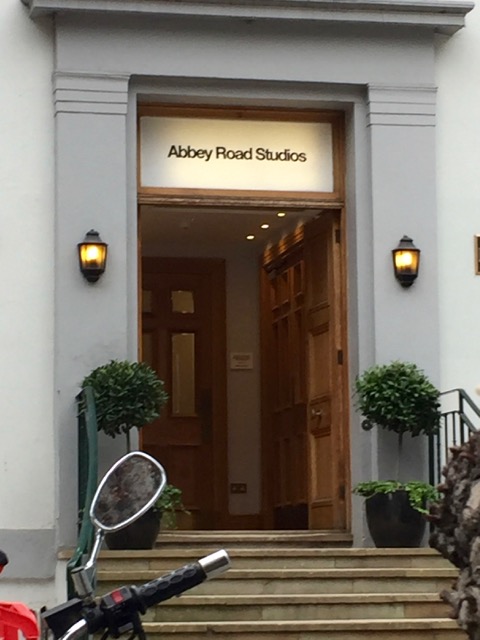
The other side of the zebra crossing is the famous Abbey Road Studios where The Beatles recorded their albums:

studios

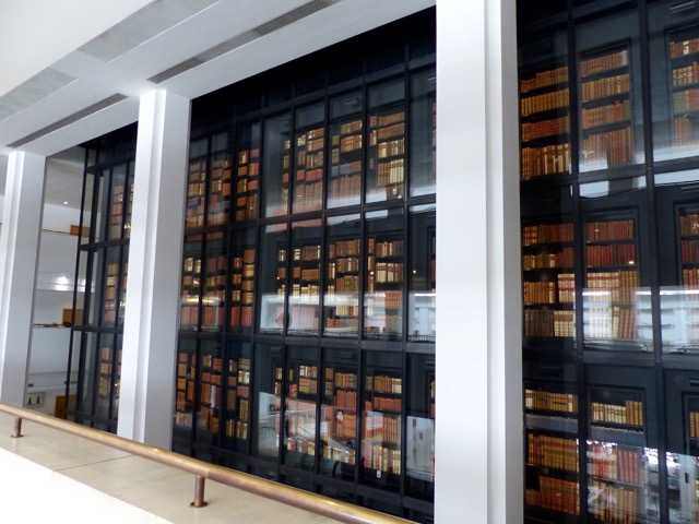
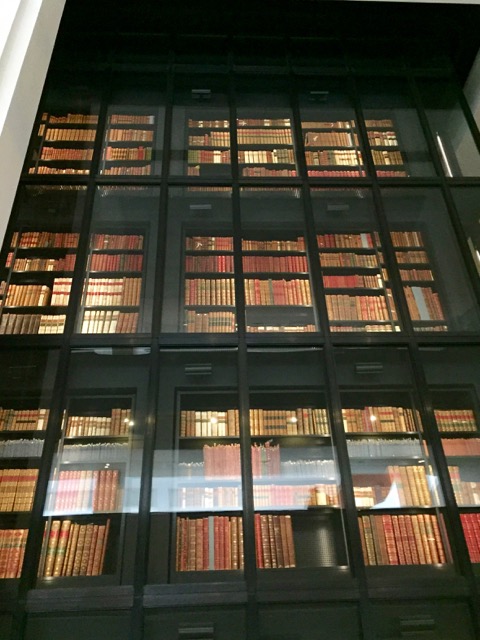
We couldn’t go into the studios, but there was a gift shop adjacent where signs were posted to chronicle the historical significance of the Abbey Road Studios. Sir Edward Elgar opened the Studios in 1931. In 1939, King George VI recorded his now famous “King’s Speech to His Peoples”.  Seventy-one years later in 2010…

Colin Firth.jpg

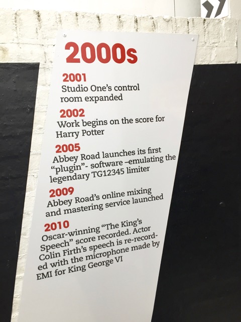
“Oscar-winning ‘The King’s Speech‘ score recorded. Actor Colin Firth’s speech is re-recorded with the microphone made by EMI for King George VI.”

Looks like we’d come to something truly historic.

**

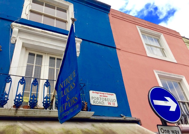
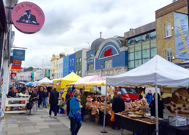
After Abbey Road, we headed to Notting Hill. I like the movie Notting Hill (1999), have seen it several times especially now it’s on Netflix, but have never been to that part of London. I’d done some Googling before I left home. Notting Hill is the actual movie location, and the famous 2-mile long Portobello Road Market there is one of the best street markets in London. And it’s open on Fridays and Saturdays only.

It was an overcast and chilly Friday morning, the clouds hung heavy, but that didn’t dampen our spirits. We took the Tube from Abbey Road Studios and got off at Notting Hill Gate Station.

In the movie, Portobello Road is where William Thacker (Hugh Grant) has his Travel Book Shop. He walks past the stalls in the Market to get to his shop.

So here it is. Portobello Road, a colourful street lined with antique and curio shops, and on Fridays and Saturdays, open stalls selling all sorts of interesting items, a bazaar like a movie set.

Portobello Rd Market.jpg

Portobello Rd.jpg


street-market

Antiques2.jpg

antique1

Antiques3.jpg

Here’s William’s Travel Book Shop location, now a gift shop. In the movie, that is where William meets American film star Anna Scott (Julia Roberts) the first time. William is totally oblivious to who she is, while a shoplifter recognizes her and has the gut to come right up to ask for her autograph. That’s William’s intro to movie culture. Here’s the location:

The Travel Book Shop.jpg

Afterwards, William buys orange juice across the street and bumps into Anna again, spilling juice on her dress. Thus, leading her to his house with the blue door nearby to clean up.

The tipping point of the movie happens on both sides of that blue door. Apparently tipped off by William’s hairy roommate Spike (Rhys Ifans), a large crowd of paparazzi wait outside that blue door the morning after Anna stays over, ready to snap anything of the star. Unfortunately it’s William who opens the door in his T-shirt and boxer, and after, Anna in her sleep wear, and last but not least, Spike opens again in his brief only.

Well, here it is, that house with the blue door, 280 Westbourne Park Road:

The Blue Door.jpg

280-westbourne-rd


And of course, the first movie I saw after I’d come home was Notting Hill, again.

That’s a wrap of my five-day London experience, my Thelma and Louise escapade for 2016 with my cousin. Obviously, no… we didn’t drive off a cliff.

***

This is a Saturday Snapshot post. Saturday Snapshot is hosted by West Metro Mommy Reads. CLICK HERE to see what others have posted.

***

Here’s a recap of my Five Days in London:

London: West End Theatre

Tate Modern: Georgia O’Keeffe Exhibition 

Day Trip to Cambridge

British Library & St. Pancras Station

British Library & St. Pancras Station

THURSDAY, OCT. 6

Well you win some and you lose some. Having tasted the delicious treat that’s the Georgia O’Keeffe at Tate Modern, I came to British Library the next day to find they’ve just finished with a major Shakespeare exhibition there marking the 400th anniversary of the Bard’s death.

The British Library is another must see for me, having ‘discovered’ it the last time I was in London a few years ago. In their Gallery is their permanent collections of iconic papers and manuscripts that define the history of civilization, like the Gutenberg Bible, The Magna Carta, handwritten score of Handel’s Messiah, Middle Eastern and Asian manuscripts and sacred scripts, Leonardo da Vinci’s notebook, handwritten lyrics by the Beatles with comic drawings on the side… just to name a few of the 200 items on display, free to the public.


Enough of words. Here are some pics of British Library:

wall-of-books

Storeys of rare books:

storeys of rare books.jpg

Looking down to the main area:

main-area

Art works are everywhere. I like this piece by British artist Patrick Hughes, entitled “Paradoxymoron”. His signature style is the changing perspective for the viewer. A ‘normal’ painting from the front:

Paradoxymoron Front View.jpg

The painting gradually shifting to 3D as the viewer moves to the side:

Shifting Perspective.jpg

Finally, from the side, a complete 3D version:

Side View.jpg

Here’s from the other side:

The other side.jpg


And how did we get to British Library? We took the Tube from Victoria Station to the St. Pancras Station. You’ve seen the magnificent make-over of King’s Cross Station from my last post, here’s another superb alchemy of the old and the new. St. Pancras Station is an international transportation hub for trains. The scale is massive and the architecture style, Gothic Revival.

st-pancras-station

I’m most impressed by the interior, the public art and the huge bronze sculpture by Paul Day (2007). Here are some pics:

St. Pancras Station.jpg

Public Art.jpg

Bronze Sculpture.jpg

Amazed by how detailed this huge sculpture is. Look at the folds of the clothing:

Details.jpg

Here are some of the vignettes circling below the tall sculpture. Whimsical perspectives:


P1020849.jpg


perspective


Saying goodbye to soldiers going to war:

Going to War.jpg


… and the modern goodbye. I like this one the best:

P1020853.jpg

***

Tate Modern: Georgia O’Keeffe Exhibition

TUESDAY, OCT. 4

Six years ago I first visited Tate Modern. I was wowed by its ingenuity, a derelict power plant on the south bank of the River Thames converted into a modern art gallery. I didn’t hesitate to revisit this time around.

The Tate Modern was designed by the Swedish architects Jacques Herzog and Pierre de Meuron, the 2001 winner of the Pritzker Prize, the ‘Nobel Prize’ of architecture.  Their concept of maintaining the industrial motif and juxtaposing it with the artistic is a marvellous idea.  Furthermore, they have turned the massive, hollow industrial space in the centre into a welcoming people space, the Turbine Hall. When I got there on an overcast Tuesday morning, I saw people, many are families with children and babies, lay on the massive floor space, yes, actually lying down, to view the mobile, mixed media installation from the ground.

How much more ‘grassroot’ can you get? The symbolism is ingenious as the people space breaks down the barrier of ‘high art’ and ‘public art’. In another area, several large helium-filled fish ‘balloons’ floating in mid-air, kids and adults playing with them. Interactive art, like an invisible sign saying, ‘Please do touch the art objects.’

While most of the collections were free and photography was allowed, I was excited to learn their current event was a Georgia O’Keeffe exhibition, paid admission and no photography. Interesting to note that there’s no O’Keeffe works in UK public collections, thus making this exhibition all the more rare and valuable.

Before I entered the exhibition room, I only had one image in my mind: flowers. Georgia O’Keeffe was a painter of flowers, wasn’t she? And with 100 pieces of O’Keeffe’s works on exhibit, lots of flowers. How wrong I was.

Certainly, the cover of this beautifully designed accordion pamphlet uses the iconic O’Keeffe subject of flowers, but I soon found that she was a highly versatile artist, and cerebral in style and subject matter. No photos were allowed in there so I had to take a picture of the pamphlet for you to visualize. For the rest of the post, I’m afraid I’ll have to make do with my clumsy written words to describe my experience with the magnificent visuals.


georgia-okeeffe-exhibition

Here’s a synopsis of the exhibition in a sequence of rooms following the life of O’Keeffe as an artist. And thanks to this compact, informative pamphlet, I’m still learning even after I’ve come home.

1. The Early Years – abstractions in charcoal, made while she was an art teacher in Virginia and Texas. There are colourful watercolours and vivid oil paintings inspired by the landscapes of both States. My fave has to be the Red and Orange Streak, 1919. So here I see Georgia O’Keeffe, the emerging abstract painter.

2. Moved to New York in 1918 and produced more abstraction while exploring other artistic possibilities such as chromesthesia, where musical tones elicit particular colours, “the idea that music can be translated into something for the eye”. This is also the period when she painted more sensory content, and for some, eroticism is evoked. I like this quote: “When people read erotic symbols into my paintings, they’re really talking about their own affairs.”

3. O’Keeffe, Stieglitz and their Circle. As muse, collaborator, and finally spouse of photographer Alfred Stieglitz, O’Keeffe is presented in photography in this section. I find O’Keeffe’s personal portraits particularly revealing; Stieglitz’s portraits of her all exude a special boldness and independence. Here we see her beginning fondness of clouds, depicted in A Celebration 1924, the year they married. Clouds evolving into petals later?

4. O’Keeffe the New Yorker. I never knew. Here I see her stylistic depiction of the urban cityscape of NYC. O’Keeffe and Stieglitz lived on the 30th floor of a skyscraper, a convenient vantage point to paint tall buildings. “… I think that’s just what the artist of today needs for stimulus.” After the 1929 Wall Street crash, however, she moved out of NYC. The vision of the urban promise dismantled with the market crash.

5. Upstate, New York, Maine, and Canada. Lake George, trees, clouds, apples and leaves. For a change, from metropolitan New York to Nature.

6. Finally, we begin to see her flower paintings. They are huge. The photo of the pamphlet cover above, Jimson Weed/ White Flower 1, 1932, is 48″ x 40″. BTW, I just checked online, that painting is the world’s most expensive painting by a woman. Walmart heiress Alice B. Walton bought it for $44.4 million in 2014. I should have looked at it a while longer. But from the short stop when I stood in front of it, I could see the gradual change of light and shadow on the petals, meticulously painted. Most impressive was the sheer size of it.

Why paint a tiny flower this big? Here’s O’Keeffe’s answer:

“Nobody sees a flower, it’s so small… I’ll paint it big and they will be surprised into taking time to look at it… I will make even busy New Yorkers take time to see what I see of flowers…”

7. New Mexico: Taos and Alcalde. Paintings of the vast, horizontal expanse of the land in contrast to the vertical, tall skyscrapers of NYC, earth-built dwellings, crosses, Native American and Spanish colonial features. In Taos O’Keeffe met Ansel Adams and other artists.

8. O’Keeffe found the white bones and animal skulls left on the barren Southwestern desert a worthy subject for her paintings. A sharp, harsh contrast with the soft petals of flowers, but the light and shadow gradients convey the same fondness from the artist’s eyes.

9. Red earth, pink cliff of the landscape in the Southwestern expanse. O’Keeffe discovered Ghost Ranch, a tourist attraction and later bought her first home there. During the 1930’s to the 40’s, she delved into the area with immense passion, especially the flat-top mountains or mesa.

10. White Place and Black Place, two locales she continued to stylize in her painting. From the realism of the earthy desert expanse shifted to more stylized contrast of white and black.

11. The artist continued her focus on bones, in particular, the holes in them; when she lifted them up towards the sky, the blue piercing out from these holes. The bones too are symbols of death and destruction, a parallel of WWII and the death of Stieglitz in 1946.

12. The Southwest and Native American influences on her subjects while living in New Mexico during the 1930’s and 40’s.

13. Lastly, from landscapes to skyscapes. I was confronted with another huge painting, inspired from her airplane travels during the 50’s and 60’s: Sky Above the Clouds III, 1963. Since I couldn’t take any pictures at the exhibition, I just have to do this. Here, take a look at this photo of the pamphlet, section 13 on the right. The painting is on there. Clouds like ice floes against a distant, pinkish sky.

sky-above-the-clouds


Definitely more than just flowers.


 ***

Related Posts on Ripple Effects:

 Tate Modern and Billy Elliot

Alex Colville and the Movies 

Art Gallery of Ontario

Beauty and Terror


London: West End Theatre

MONDAY, OCT. 3

I arrived London Gatwick Airport around noon. Found my way to the shuttle taking me from the North to the South Terminal to catch the Gatwick Express heading for central London. Once on the train, it was a smooth and fast ride, just 30 minutes and I was at Victoria Station. My cousin was already waiting for me there to begin our 5-day escapade. After settling into our lodging it was already mid-afternoon. What to do with just a half day in London?

We decided to take the Tube and head to Leicester Square to check out bargain tickets for the shows that evening. We had nothing planned, no agenda, and in no hurry… for a change. And that’s what I call a holiday.

Leicester Square is the place for buying cheap same day theatre tickets. We had nothing in mind. We stopped by several ticket booths and nothing really piqued our common interest. Several we’d seen; the one  I’d really wanted to see before wasn’t on anymore, and that’s Skylight with Carey Mulligan and Bill Nighy. I came to the West End two years late.

Then we turned into Shaftesbury Avenue, and we knew what to see: The Go-Between at the Apollo Theatre. My cousin wanted to see Michael Crawford—the original Phantom—without the mask, albeit thirty years older, and I wanted to see the stage musical adaptation of L. P. Hartley’s famous novel. That scene in the movie with Julie Christie and Alan Bates rolling on the haystack in the barn emerged in my mind. Wow, that was some longterm memory. That’s a 1971 movie.

We quickly walked back to the Square to find the TKTS ticket booth. Why the TKTS? It’s the official London theatre ticket booth, operated by the Society of London Theatre with all profits going to support the theatre industry. I was delighted to be able to get two very good seats, dress circle centre, at 70% off, £25 each.

Ticket.jpg

We still had about two hours before the 7:30 pm show began, so into near-by Chinatown we went. I saw tourists taking pictures of the BBQ ducks hanging inside the windows of eateries. No, I’d never thought of photographing ducks other than with them swimming on the pond. Anyway, that’s what I had for dinner. A bowl of noodles with two kinds of BBQ meats, duck and pork, only £6.50, a very good price I think.

The Apollo Theatre opened in 1901, a month after the death of Queen Victoria, making it the first Edwardian theatre to open in London. It was already dark when we got to the doors so I didn’t have a good view of the architecture. But once inside, I was mesmerized by the beauty of its historic glamour.

apollo-theatre

On the stage you see a chest, the centrepiece. Instead of a red box that stores mementos and a diary as in the novel, the playwright had turned it into a large chest, which is appropriate, for we see the boys Leo and Marcus step on it as they sing. The same with the chairs, they’re for standing on.

When Leo Colston (Michael Crawford) in his old age opens up the memory chest, his past as a youngster acting as a go-between for two secret lovers of different classes rises up to haunt him. The time is the turn of the twentieth century, in a setting like Downton Abbey. Come to think of it, Downton has a much more progressive outcome, chauffeur Tom can have Lady Sybil, but not farmer Ted and Lady Trimingham, Marian.

gb

The Go-Between is a musical, but not your spectacles like The Phantom of the Opera, Les Miserables, or The Lion King. It’s a chamber work, small scale, and drawing you into the story more readily rather than showing off grandeur and technicalities. Richard Taylor’s music, however, may not be as readily inviting as the popular tunes from those larger productions. With only a piano as accompaniment, the characters at times sing a cappella, and at times in dissonant chords. Michael Crawford, 74, loved it, but indicated in an interview that the music had been technically demanding.

What did I get from the show? The book’s famous intro line sure hits home:

“The past is a foreign country: they do things differently there.”

That says about my early days as a teenaged cinephile, and actually just arrived Canada from a foreign country. Going to see The Go-Between movie in the cinema was itself a coming-of-age episode for me. I remember that was a more ‘mature’ film than this musical play, or is it because I was just a tender lass. No matter, now, I should get hold of the novel. I’ve never read it.

Only a few hours in London and it already felt like a full day. Four more to go.

***

Related post on Ripple Effects:

Here’s the link to my New England Fall Foliage Road Trip, last year’s escapade.

Saturday Snapshot Oct. 15: Five Days in London

About this time last year I’d just finished a Thelma-and-Louise kind of road trip (exclude the ending, of course) to New England with my cousin to see fall foliage. The series of travel posts begins here.  This year, it’s London, England.

Here are the highlights of our short, five-day escape to London on the week of Oct. 3-7. Detailed blog posts to come.

MondayThe Go-Between at the historic Apollo Theatre (since 1901) on Shaftesbury Avenue. Leading star is Michael Crawford, the original Phantom.


Apollo Theatre.jpg

gb

Tuesday — Tate Modern, Georgia O’Keeffe Exhibit. No photos allowed for that exhibit, but I was free to take artworks from other areas in brilliant Tate Modern. Here’s one I love the best. View from its 10th floor observation level:

img_4373


Wednesday — Day trip to Cambridge:

Cambridge.jpg

Thursday — The British Library, King’s Cross and the St. Pancras Stations. Why a train and tube station could be the highlights of the day? Wait and see. Here’s St. Pancras Station:

St. Pancras Station.jpg

Friday — Which zebra crossing (those in N. America, no zebra, just pedestrian) is a point of interest for world visitors?

Abbey Road Studios.jpg

And which movie puts a community and street market on the to-see list of visiting cinephiles and antique hunters?

Portobello Rd (1).jpg


Detailed London posts coming up.

***

Saturday Snapshots is hosted by West Metro Mommy Reads. CLICK HERE to see what others have posted.

AGO Exhibition: Terror And Beauty

The Art Gallery of Ontario, AGO, is a must-see whenever I visit Toronto. Not only because I’m a Frank Gehry fan who never gets tired of looking at the centre spiral staircase in there, but the exhibits are always intriguing and thought-provoking. Spent a few days in Toronto last week and this time, I was much gratified to view the current show at AGO: “Francis Bacon, Henry Moore: Terror and Beauty”.

Terror and Beauty, the motif resonates with the idea of Wabi-sabi. I’ve explored visually the notion of Wabi-sabi before. Two seemingly incompatible states juxtaposed against each other, beauty and sadness.

“You can’t be more horrific than life itself” says a quote from Francis Bacon on the AGO’s Artist page. The exhibits speak to that by extracting from the horrors of WWII and other forms of human sufferings and struggles depicted in the works of these two 20th century Irish/English artists who were contemporaries of each other.

The exhibit is a wealth of surrealist works from Bacon, and sculptures and drawings from Moore. But I was particularly captivated by the WWII items. While Moore is well-known for his abstract sculptures of the human body in larger than life poses, here’s a rare chance to see his more personal, wartime drawings.

Going home one evening in 1940, as he entered a London subway station, Moore discovered crowds of people sleeping on the platform to take shelter from an impending German air strike, the Blitz. He was taken aback by what he saw and his later drawing was a ghastly interpretation:

Tube Shelter Perspective 1941 by Henry Moore OM, CH 1898-1986

Photo Source: http://www.tate.org.uk/art/artworks/moore-tube-shelter-perspective-n05709

That’s Moore’s view of the underground subway station used as impromptu bomb shelter. But what was it really like in those tube stations? That’s when I was totally captivated by the photos of the renowned photojournalist Bill Brandt displayed alongside Moore’s shelter drawings.

Rather than horrific depictions, I was utterly surprised by the actual photographs by Brandt, who acted as official war photographer. His noir and darkened perspective is haunting and yet, full of mystique and beauty.

What I saw was an opposite interpretation of the subway scene: rather than terror, I saw resilience. Indeed, the London populace came out in droves to seek shelter in the subway, a much safer haven than their own homes. What I saw in many of Brandt’s photographs was the strong sense of ‘life goes on’.

Two photographs in the exhibition will forever remain in my mind.

First is the Liverpool Street Underground Station Shelter during an air raid in November, 1940. The photograph shows a family sleeping soundly, bedding against the grooves in between the steel structures of the tunnel. But look more carefully, there’s even a bunk and blanket for a doll beside the child. They all look peaceful and calm.

For the archive in my mind, let me call this photo: “The Doll in the Subway”

Sleeping in the subway bunk-child & doll

© IWM Non-Commercial License http://www.iwm.org.uk/collections/item/object/205194652?cat=photographs

The second picture by Brandt is in the Elephant and Castle London Underground Station Shelter. Here, people sleeping on the crowded platform while taking shelter from German air raids during the Blitz.

But look how they were dressed in. The mid-heel pump the woman in the foreground was wearing caught my attention. Looks like she was dressed for work. Blitz or no Blitz, after she woke in the morning, she had to go to work. Life as usual.

In my mental archive, this photo will now be entitled “The Mid-heel Pump”.


The mid-heel pump

© IWM Non-Commercial License http://www.iwm.org.uk/collections/item/object/205194638

What more, after civilians had crowded into the subway stations against government’s advice, the officials had to respond with helpful measures by installing chemical toilets, first aid facilities, and providing drinks, while the people created their own entertainment. With all due respect to the victims of the Blitz, the resilience and adaptability of the Londoners are most inspiring.

After I stepped out of AGO, I wanted to go back in to take a more careful look at the exhibits again. But that was not feasible so I had to write this post from memory (no photos of the exhibits were allowed) and from some online digging. Glad to have found these two  memorable images from the Imperial War Museum website. Thanks to AGO, these two historic photos will remain in my mental archive for a long, long time.

CLICK HERE to see 9 Incredible photos of the London Underground as Bomb Shelter.

***

Related Posts on Ripple Effects:

The Frank Gehry designed Art Gallery of Ontario

Sketches of Frank Gehry (2005)

Art Gallery of Alberta


Tate Modern and Billy Elliot

Solution to Arti’s Cryptic Challenge #1:  London… don’t mind the gap.

When time is short, you must select and forego.  The Tate Modern has long been on my ‘must-see’ list yet unfulfilled.  So for the short stay I had in London, I chose this one above all else.  Five years ago, my then 15 year-0ld son went to visit and wrote in his email back to me: ‘Tate Modern is brilliant.’  This time I got to see it first hand.

If a museum of modern art can wow a teenager, there must be something in there that links the gap.  And was I disappointed?  Yes and no.  No because it was brilliant indeed, both the conceptual design, architecture and the exhibits.  And yes, because I was so preoccupied with the directions getting there from our hotel that I forgot my camera.  No excuse for that, I know.  And what makes it worse, the museum allows photography even of its exhibits.  In my utter disappointment, my now 20 year-old said to me calmly, ‘you just have to make do.’  That I did with my iPhone.

The Tate Modern was converted into a modern art museum from an obsolete power plant on the south bank of the River Thames.  The idea itself is brilliant. What better use of a derelict power station along the beautiful Thames?  Used to be a gloomy stretch of land by the river bank, now the whole area, the Southbank, is revitalized and is home to many London attractions, including the Shakespeare Globe Theatre, the Millennium Bridge, The London Eye, theatres and green, open space.

And thanks to Wikipedia Commons, I found the following photos.  The Tate Modern viewed from the Millennium Bridge.

The Tate Modern was designed by the Swedish architects Jacques Herzog and Pierre de Meuron, the 2001 winner of the Pritzker Prize, the ‘Nobel Prize’ of architecture.  Their concept of maintaining the industrial motif and juxtaposing it with the artistic is ingenious.  Furthermore, they have turned the massive industrial space into a people space.  The main entryway is named The Turbine Hall, allowing people to fill the massive vacuum that was once associated with a power plant. The huge area also makes display of larger pieces of exhibits possible.  Now they are doing it again, yet another redesigning, an even more amazing remodelling and addition, all for the 2012 Olympics Summer Games in London.

Two streams of thoughts constantly ran through my mind during this trip.  One was the dichotomy of ‘High Art’ and ‘Public Art’, ‘high culture’ and ‘popular culture’.  Does such a rift still exist?  All the galleries and museums I visited were all flooded with people.  It was hard to take a picture without any heads caught in the frame.  So every photo I took was immediate.  I had to wait for people to move away and snap the moment quickly.  In the Turbine Hall at the Tate Modern, I saw families with young children, many pushing baby carriages, kids doing cartwheels on the huge floor space.

Is it still ‘high art’ if the exhibits are free to the public, a destination for family outing?  As a rock concert ticket can cost hundreds of dollars… now does that re-define the ‘high’ in culture?  Is it still ‘high art’ if people can get in free, as with the Tate Modern collection, enjoy what they see, gasp at the possibilities, or be bewildered by a notion conveyed through an artwork?  Do we need to ‘understand’ art in order to enjoy it?  Maybe we should just allow the object of art to speak for itself, and thereby, linking the gaps between us.

Here are a few exhibits I took with my iPhone.  Please do click on the link of each piece to see the good photos at the Tate Modern website and an explanation.  I was gratified to see works from some of my favourite artists in their original.

Metamorphosis of Narcissus by Salvadore Dali, the work that changed Freud’s original negative view of Surrealist art.  In the painting, you’re supposed to see Narcissus on a pedestal in the background, then kneeling by the fatal pond, and lastly transformed into a flower… and what a self-absorbed egghead he was:

.

Man with a Newspaper (1928) by René Magritte (1898-1967), under the section ‘Poetry and Dream’.  These are supposedly four different perspectives … mmm … , but hey, this is Magritte speaking.  His dead pan surrealist style is regarded as a subtle form of social critique.

.

And here are a few other interesting works. Polish artist Magdalena Abakanowicz’s ‘Anti-form’ sculpture which she created during the 1960’s Soviet-occupation of Warsaw, another example of the freeing effect of art and the social statement they subtly convey:


Untitled sculpture with wood and wool by Jannis Kounellis, homage to Jackson Pollock’s drip painting:

.

I like this work of open books, but don’t remember the artist or the name of it.  With the fast emergence of eBooks, this work could soon become an antique artifact:

***

The second event I chose was to see ‘Billy Elliot The Musical’.  I liked the movie a lot, appreciating the depth of conflicts which touch on the same dichotomy: ‘High Culture’ and ‘Mass Culture’, and the seeming incompatibility of art and life.  A miner’s son in a blue collar neighbourhood is attracted to the beauty of the ballet, and the freeing energy of dance.

The conflict persists starkly as the political backdrop of the miners’ strike turns ugly in the 1984-85 years. While their livelihood is at stake, and as the miners determine to pose the fiercest strike action against the Thatcher government, where does ballet come in?  It sounds trivial and even surreal to think of ballet compared to the major battles raging in the country. But this is also a conflict between the individual and the masses, the individual and, yes, even the family.

Billy’s new-found love and immense talent ultimately melt the heart of his macho father and older brother, and soon those in the mining community.  He is given the chance to audition for the National Ballet School, with the local miners raising funds to support his cause.


The movie allows more in-depth exploration of internal conflicts while as a musical, the focus has shifted to the dance performance, the music, and for crowd appeal, some Monty Python style romp com, mellow-dramatic scenes, and many exaggerated, stereotypical expressions and language choices. I’m afraid it looks like a contrived way to bring the ‘high’ down to the ‘common’ level.  Elton John’s music while lively, seems lacking in variety and depth compared to his other works and those in the Andrew Lloyld Webber tradition.

Performed on the London stage since 2005 and still going strong, ‘Billy Elliot the Musical’ is directed by Stephen Daldry, lyrics and book by Lee Hall.  It has won both the Lawrence Olivier Awards in England and the Tony Awards in the US.  It went on Broadway in 2008, and on the main stages in several other countries.  The night I went the role Billy Elliot was performed by 12 year-0ld Rhys Yeomans, and he was marvellous, both as actor and dancer.  He practically carried the whole show on his young shoulders, singing, acting, and dancing in superb style, energy, and versatility.  The role of Michael, Billy’s friend, was done animatedly by another 12-year-old, Reece Barrett. The boys’ performance were the main attractions for me.

In the middle of the show however, the performance was interrupted by a technical difficulty.  It was no minor glitch.  We had to wait in our seat for around 15 minutes before performance resumed.  Now that had discounted some of my enjoyment.  And when the show started again, a scene was skipped.  But overall, it was quite an experience at the Victoria Theatre in London.  A good choice I still think considering the limited time I had in London.